Basic Usage and Structure of UI Components
Author: Charley
UI Components are the core building blocks of the Classic UI System. They encapsulate a wide range of commonly used interface features, allowing developers to efficiently construct various types of user interfaces.
1. What Are UI Components
From an engine class hierarchy perspective, UIComponent serves as the base class for all UI components in the Classic UI System. In other words, all UI components are subclasses derived from UIComponent, sharing common interfaces and behavioral patterns.
UI components can be categorized into basic components and container components.
Box and all its subclasses are considered container components, responsible for hosting and arranging other UI nodes.
All other components (outside the Box hierarchy) are generally basic components, used for directly displaying interface elements such as text, images, and buttons.
1.1 Basic UI Components
There are 17 types of basic UI display components, all directly or indirectly inheriting from UIComponent, as shown in Figure 1-1 (highlighted).
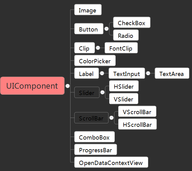
(Figure 1-1)
1.2 Container Components
Including Box itself, there are nine container components that inherit from it, as shown in Figure 1-2 (highlighted).
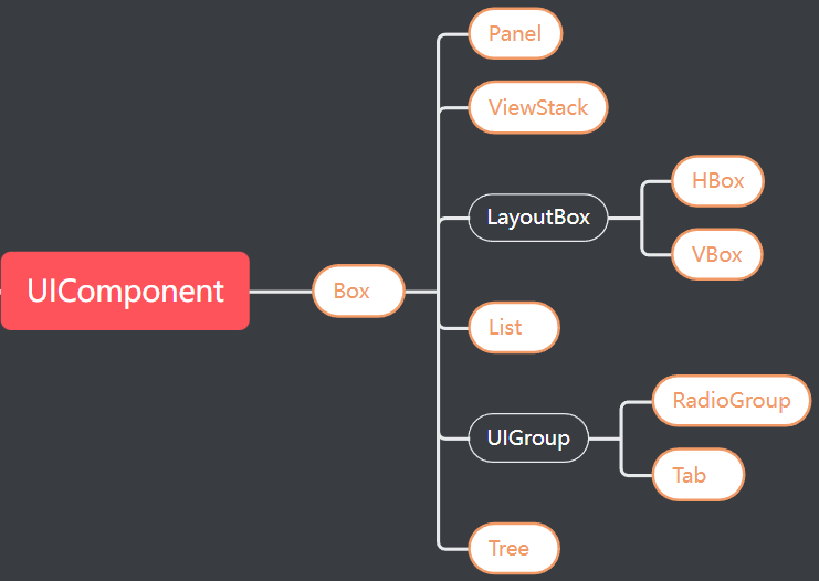
(Figure 1-2)
These containers are not meaningful on their own — they must contain basic UI components as child nodes to form complete and functional UI elements.
For example:
- A
Listmust include basic UI components as list item renderers. - A
RadioGroupserves as a container for multipleRadiocomponents.
1.3 Dialog Components
From the class hierarchy, the Dialog component (Dialog) does not inherit from UIComponent, and therefore does not formally belong to the UI component system. Its inheritance structure is shown in Figure 1-3.
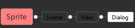
(Figure 1-3)
However, in practice, Dialog is one of the most frequently used components in the Classic UI System and is categorized as a UI component within the IDE. It is widely used for pop-up windows, alerts, and modal dialogs.
2. How to Use UI Components
There are three main ways to create UI components:
- Drag components from the Widgets Panel.
- Create components from the Hierarchy Panel’s right-click menu.
- Name your image resources according to UI Component Naming Rules and drag them into the IDE — they’ll be recognized automatically.
2.1 Dragging from the Widgets Panel
The Widgets Panel includes both basic nodes and UI components. You can drag them directly into the Hierarchy Panel or the Scene Editor Window, as shown in Animation 2-1.
(Animation 2-1)
2.2 Creating via the Hierarchy Right-Click Menu
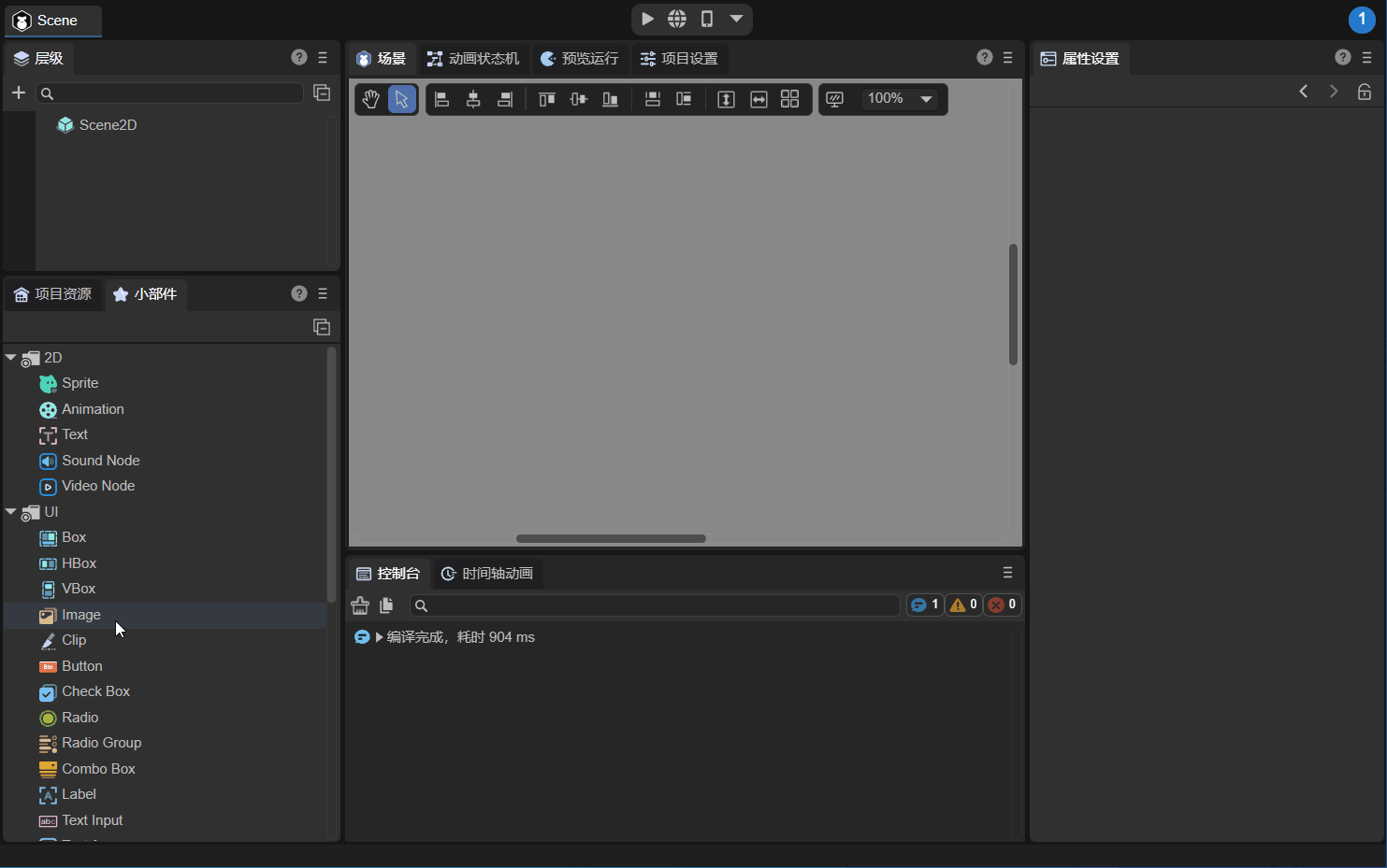
In the Hierarchy Panel, under the 2D node section, you can right-click and directly create a UI component, as shown in Figure 2-2.
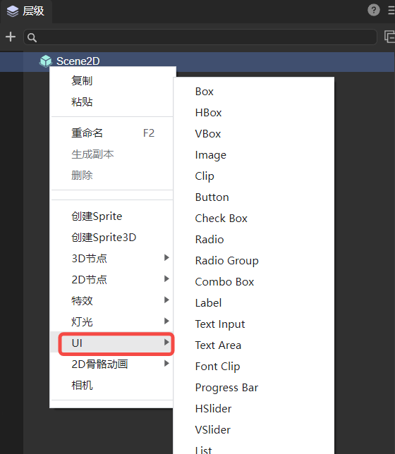
(Figure 2-2)
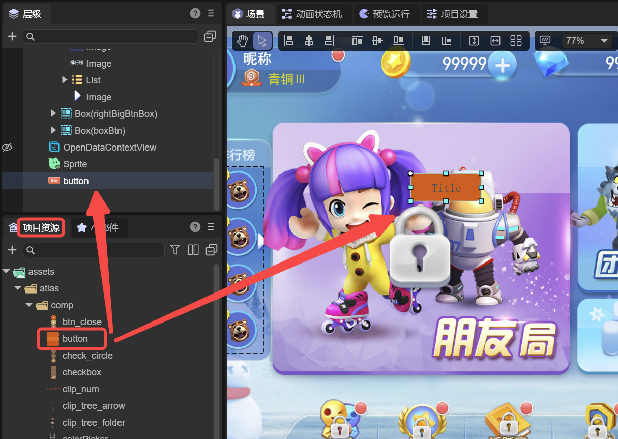
2.3 Dragging from the Resource Panel
If a resource’s name follows the UI Component Naming Rules (see related documentation), dragging it into the hierarchy or scene view will cause the IDE to automatically create the corresponding UI component, as shown in Figure 2-3.
(Figure 2-3)
3. Base Properties of UI Components
UI components feature several special properties that are unique to the UI System, such as relative layout, data binding, graying (gray effect), and mouse event disabling.
These features are not available in basic 2D objects like Sprite.
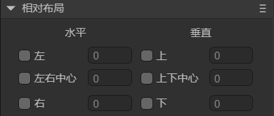
3.1 Relative Layout
As shown in Figure 3-1, every UI component supports a set of properties for relative positioning, whereas basic display objects (e.g., Sprite) only support absolute positioning.
(Figure 3-1)
In relative layout, the component’s position is calculated relative to its parent node, providing high flexibility and enabling automatic adaptation to different screen sizes and orientations — ensuring consistent and user-friendly UI layouts across devices.
Example code:
this.xx.left = 0;
this.xx.right = 0;
this.xx.top = 0;
this.xx.bottom = 0;
this.xx.centerX = 0;
this.xx.centerY = 0;
3.2 Data Binding (dataSource)
In practice, data retrieved from a server may not always match the structure expected by UI components — especially when working with list components.
The dataSource property allows developers to map or transform the original data structure to fit the UI’s rendering requirements.
Example:
import { ItemBoxBase } from "./ItemBox.generated";

const { regClass, property } = Laya;

@regClass()
export class Script extends ItemBoxBase {
    constructor() {
        super();
    }

    get dataSource(): any {
        return super.dataSource;
    }
    set dataSource(value: any) {
        super.dataSource = value;
        if (!value) return;

        // Assign data to child node properties
        if (value.avatar) {
            let redHot = this.getChildByName("avatar").getChildByName("redHot") as Laya.Image;
            redHot.visible = value.avatar.redHot.visible;
        }

        if (value.flag) {
            let flagText = this.getChildByName("flag").getChildByName("flagText") as Laya.Text;
            flagText.text = value.flag.flagText.text;
        }
    }
}
3.3 Graying and Disabling Mouse Events
Setting the gray property changes the component’s appearance to a grayed-out state, displaying colored elements in gray, as shown in Figure 3-2.
This is typically used to indicate that an element is “inactive” or “unavailable.”
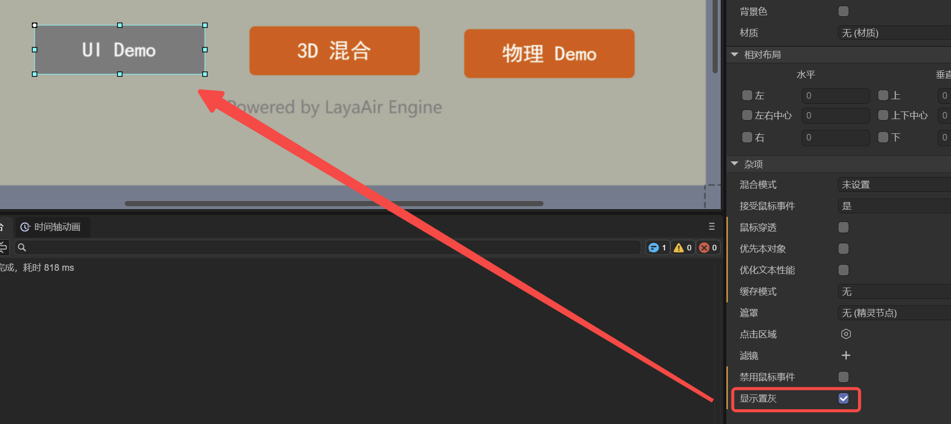
Setting the disabled property will not only disable mouse interactions (e.g., prevent button clicks) but also automatically apply the gray effect, providing clear visual feedback that the component is non-interactive.
Example:
this.xx.disabled = true;