Button (GButton)
Author: Gu Zhu
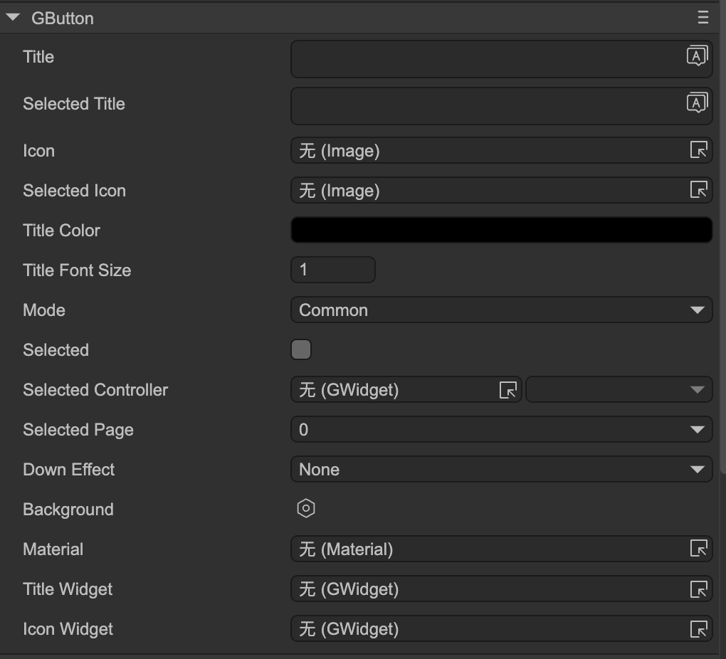
- Title — The button title. You must first set the
Title Widget. - Selected Title — Title when the button is selected; meaningful for check or radio buttons.
- Icon — The button icon. You must first set the
Icon Widget. - Selected Icon — Icon when the button is selected; meaningful for check or radio buttons.
- Title Color — Color of the title text.
- Title Font Size — Font size of the title.
Mode — Button mode:
Common— Normal button.Check— Check button. Clicking toggles between selected and unselected states.Radio— Radio button. Clicking sets it to selected; cannot automatically deselect. Usually multiple radio buttons form a radio group. See Controller and Button Interaction for details. Radio buttons are also used in selection-mode panels.
- Selected — Selected state; relevant for check or radio buttons.
- Selected Controller — See Controller and Button Interaction.
- Selected Page — See Controller and Button Interaction.
Down Effect — Built-in press effects; meaningful for normal buttons. If these are insufficient, use the button’s internal controller to implement custom effects:
Dark— The button darkens when pressed.UpScale— The button enlarges when pressed.DownScale— The button shrinks when pressed.
- Sound — Plays a sound when the button is pressed.
Functional Widgets Binding
These properties bind the button’s functional sub-components. Note: if the button node is part of a prefab instance, these properties are hidden.
- Title Widget — Sets the text sprite. Changing the Title property actually modifies this component.
- Icon Widget — Sets the icon sprite. Changing the Icon property actually modifies this component.
Button Controller
Typically, a button contains a button controller named "button". This is optional if no special effects are needed.
Controller pages:
- up — Normal state.
- down — Normal button pressed state / selected state for check or radio buttons.
- over — Mouse pointer hovers over the button.
- selectedOver — Selected state when the mouse pointer hovers over the button.
- disabled — Button is disabled.
- selectedDisabled — Selected state when the button is disabled.
A standard 4-state button usually uses up/down/over/selectedOver. On mobile devices, up/down may suffice. When a button is disabled, a default gray effect is applied. To customize, design using disabled and selectedDisabled pages.
In the controller design page, you can quickly add these pages using the button highlighted in the red box, as shown below:
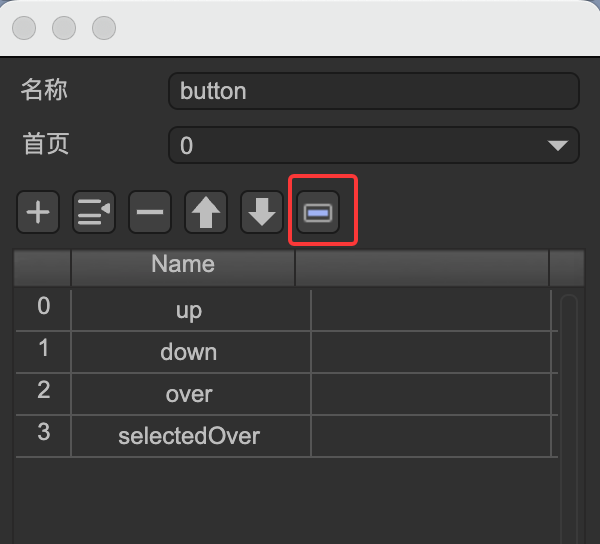
(Fig. 1-1)