Widget (GWidget)
Author: Gu Zhu
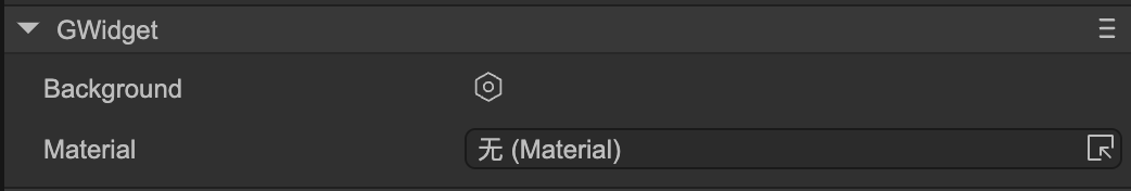
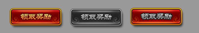
Background– Sets the background color, border width, and border color for the widget.Grayed– When checked, the widget will appear in a grayed-out state. Note that being grayed does not mean it cannot be clicked; to disable clicking, you also need to set theMouse Enabledproperty. By default, graying is implemented using a color filter, but you can also customize it using a controller.For example, a button component consists of a background and an image/text on top. In the left image, it shows the normal state; in the middle image, it shows the grayed state applied. If you want only the image/text to gray while keeping the background unchanged, you can define a controller named
grayedin the component to control the gray effect specifically. Once this controller exists, the default overall graying effect is disabled.
Tooltips– When the mouse hovers over the widget, a text tooltip appears, and it disappears when the mouse leaves. To use tooltips, follow these steps:- Create a prefab with a root node of type GLabel and configure its text widget so the system can set the tip text to the label’s
Titleproperty. - Open “Project Settings -> UI System” and drag your prefab into the “Tooltip” input field.
- Create a prefab with a root node of type GLabel and configure its text widget so the system can set the tip text to the label’s
text and icon
Images and text are the two most fundamental display elements in the UI system. Accessing and setting a component’s title and icon is a high-frequency operation, so the GWidget base class provides the text and icon properties.
For example, for an image, the following two lines are equivalent:
aImage.src = 'xxx.png';
aImage.icon = 'xxx.png';
For a button, the following two lines are equivalent:
aButton.text = 'hello';
aButton.title = 'hello';
Therefore, if the exact node type is unknown but you need to set a title, you can use text. For instance, setting the text of a GTextField uses text, setting a GButton’s title uses title, but using text works for both. The same applies to icon.