Dropdown (GComboBox)
Author: Gu Zhu
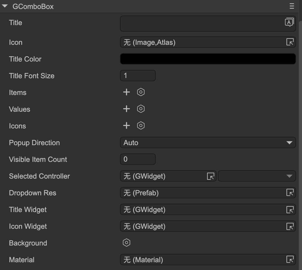
- Title — Dropdown title. You must first set the
Title Widget. - Icon — Dropdown icon. You must first set the
Icon Widget. - Title Color — Color of the title text.
- Title Font Size — Font size of the title.
- Items — Titles of each item in the dropdown.
- Values — Values for each item, used in code logic.
- Icons — Icons for each item.
Popup Direction — Direction the dropdown opens:
Auto— Automatically determines direction based on dropdown position. For example, if the dropdown is near the bottom of the stage, it will open upwards to avoid clipping content.Up— Opens upward.Down— Opens downward.
- Visible Item Count — Limits the number of visible items. Items exceeding this count are scrollable.
- Selected Controller — See Controller and Dropdown Interaction.
Functional Widgets Binding
These properties bind the dropdown’s functional sub-components. Note: if the dropdown node is part of a prefab instance, these properties are hidden.
- Dropdown Res — Dropdown resource, which is a prefab. Typically designed as a background + list. The background should adapt to the container’s width and height. The list must be named
"list"and usually requires vertical scrolling. - Title Widget — Sets the text sprite.
- Icon Widget — Sets the icon sprite.
Button Controller
The dropdown usually contains a controller named "button", since its behavior is similar to a button. Design it like a button:
- When the dropdown is clicked and expanded, the
"button"controller stays on the"down"page. - When the dropdown collapses, the
"button"controller returns to"up"or"over"page.