Controller
Author: Gu Zhu
Overview
The Controller is one of the core features of the new UI system. It supports common UI behaviors such as:
- Pagination — A component can consist of multiple pages and can be switched visually in the IDE (WYSIWYG).
- Button States — Buttons usually have multiple states (pressed, hovered, etc.). Controllers can assign different display content for each state.
- Property Variations — Controllers allow a component to have multiple appearances and switch between them easily.
1. Controller Design
A controller is a property of the GWidget class, so any UI component can have one.
You can create a controller in the IDE as shown below:
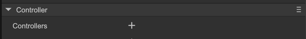
(Fig. 1-1)
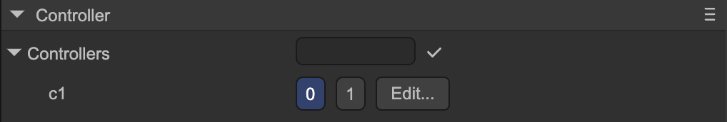
(Fig. 1-2)
Once created, if the node is the root of a prefab, you can quickly switch controller pages in the scene view top bar:
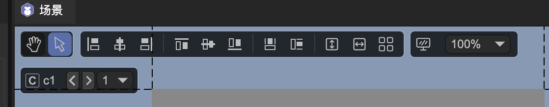
(Fig. 1-3)
Click the “Edit” button or the “c” icon to enter the controller editing interface:
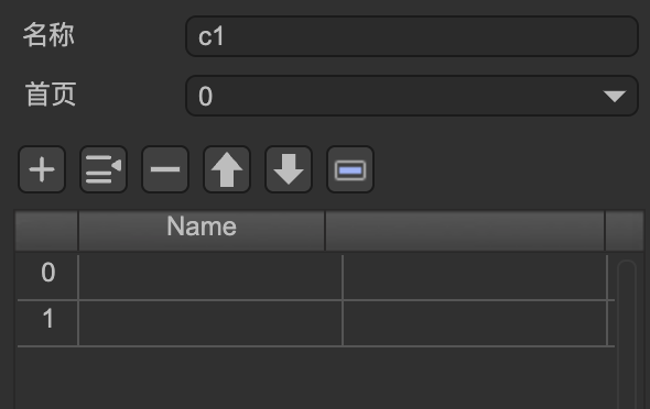
(Fig. 1-4)
Controller properties:
- Name — The name of the controller. Controllers within the same component must have unique names.
- Home Page — The default page when initialized, usually 0.
Pages — Each page has an index and an optional name.
- If no name is given, pages can only be switched via index in code.
- If named, pages can be switched via name or index.
2. Property Control (Gears)
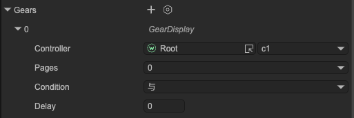
Each UI node can change its properties when any controller page changes (its own or another node’s controller). This is called Property Control, and each controlled property is represented as a Gear.
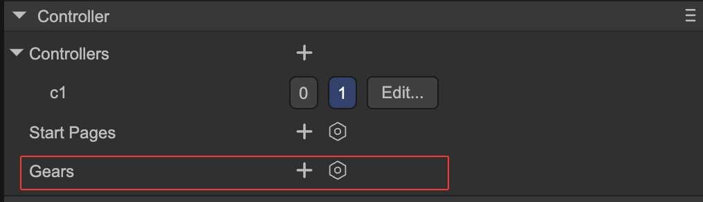
(Fig. 2-1)
Click the “+” icon to select a property to control:
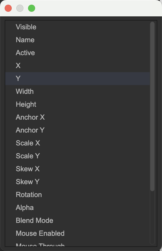
(Fig. 2-2)
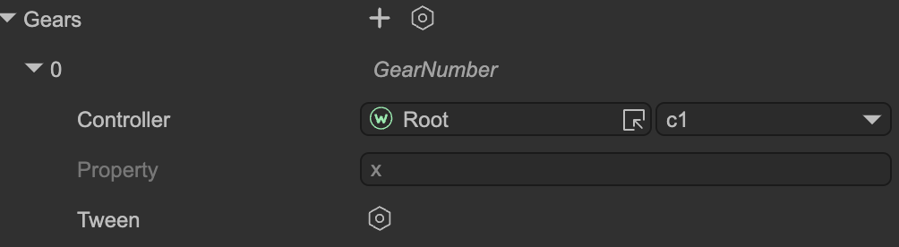
For example, selecting the “X” property means setting different X coordinates for different controller pages:
(Fig. 2-3)
Property settings:
- Controller — Choose the controller controlling this property (own or other node).
- Property — The property being controlled (read-only).
Tween — Enable animation.
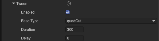
- Example: page 1 X = 100, page 2 X = 200. Switching without tween instantly sets X = 200; with tween, X transitions smoothly from 100 → 200.
After creating the tween instance:
(Fig. 2-4)
- Enabled — Whether to use animation.
- Ease Type — Easing curve or motion type.
- Duration — Tween duration in milliseconds.
- Delay — Delay before starting the tween after page switch in milliseconds.
In the Gear interface, you don’t directly set X values. To assign different X values per page, simply switch to the page in the controller and modify the component’s X coordinate in the IDE. The IDE automatically records the value per page.
Special Case: “Visible” Property
If the controlled property is Visible, the interface and operation differ:
(Fig. 2-5)
- This Visible flag is independent of the component’s own
visibleproperty; it controls node visibility externally. - Pages — Select the page(s) where the component will be visible; it will be hidden on other pages.
Condition — If multiple Visible gears exist, their logic is combined here:
AND— Visible only if all conditions are met.OR— Visible if any condition is met.
- Auto-delay hide — If visibility and other animated properties (like X) are controlled together, the component will remain visible until animations complete, then hide.
3. Interaction with Buttons
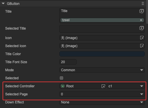
Controllers can link to buttons, so when a button is clicked or its state changes, the controller page changes accordingly:
(Fig. 3-1)
Button behavior by type:
- Normal Button — Switches controller to the assigned page when clicked.
Radio Button — Switches controller to the assigned page when selected.
- When the controller changes to the page, the button is selected.
- When the controller switches away, the button is deselected.
- Checkbox — When checked, switches controller to the assigned page; when unchecked, switches to the other page (e.g., controller has pages 0 & 1, assigned page = 0, uncheck → switch to page 1).
This mechanism can implement a RadioGroup — multiple mutually exclusive radio buttons. Create a controller with multiple pages and connect each radio button to a page to form a radio group.
In code, get or set the selected button via selectedIndex or selectedPage.
By also binding other element properties (like visibility) to the same controller, you can implement a TabControl.
Hence, the new UI system does not include built-in TabControl or RadioGroup components — controllers can handle them easily.
4. Interaction with Dropdowns
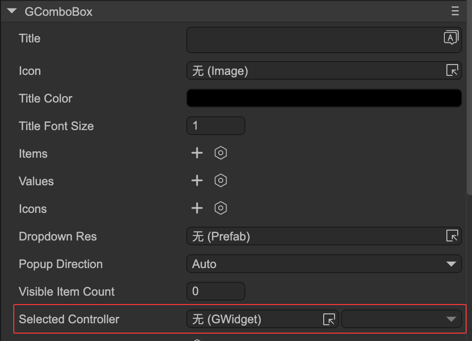
Controllers can link with Dropdowns.
- Changing the dropdown selection automatically switches the controller to the corresponding page index.
- Changing the controller page updates the dropdown selection.
(Fig. 4-1)
5. Interaction with Selection
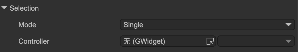
Controllers can link with Selection components.
- Changing the selection automatically updates the controller page.
- Changing the controller page updates the selection index.
(Fig. 5-1)
6. Common API
During runtime, controllers can be used as follows:
let c1 = aWidget.getController("c1");

// Set active page by index
c1.selectedIndex = 1;

// Or set by page name
c1.selectedPage = "page_name";

// Get current active page
console.log(c1.selectedIndex);

// Another simple way to change page
aWidget.setPage("c1", 1);
Controller change event:
c1.on(Laya.Event.CHANGED, () => {
    console.log(c1.selectedIndex);
});